Kotlin Notebook と Kandy でのデータ可視化
Kotlinは、強力かつ柔軟なデータ可視化のためのオールインワンソリューションを提供し、複雑なモデルに踏み込む前に、直感的な方法でデータを提示および調査できます。
このチュートリアルでは、Kotlin Notebook と Kandy および Kotlin DataFrame ライブラリを使用して、IntelliJ IDEA でさまざまな種類のグラフを作成する方法を示します。
始める前に
-
最新バージョンの IntelliJ IDEA Ultimate をダウンロードしてインストールします。
-
IntelliJ IDEA に Kotlin Notebook plugin をインストールします。
または、IntelliJ IDEA 内の Settings | Plugins | Marketplace から Kotlin Notebook plugin にアクセスします。
-
File | New | Kotlin Notebook を選択して、新しいノートブックを作成します。
-
ノートブックで、次のコマンドを実行して Kandy と Kotlin DataFrame ライブラリをインポートします。
%use kandy
%use dataframe
DataFrame を作成する
まず、可視化するレコードを含む DataFrame を作成します。この DataFrame には、ベルリン、マドリッド、カラカスの月間平均気温のシミュレートされた数値が格納されます。
Kotlin DataFrame ライブラリの dataFrameOf() 関数を使用して、DataFrame を生成します。次のコードスニペットを Kotlin Notebook で実行します。
// The months variable stores a list with the 12 months of the year
val months = listOf(
    "January", "February",
    "March", "April", "May",
    "June", "July", "August",
    "September", "October", "November",
    "December"
)
// The tempBerlin, tempMadrid, and tempCaracas variables store a list with temperature values for each month
val tempBerlin =
    listOf(-0.5, 0.0, 4.8, 9.0, 14.3, 17.5, 19.2, 18.9, 14.5, 9.7, 4.7, 1.0)
val tempMadrid =
    listOf(6.3, 7.9, 11.2, 12.9, 16.7, 21.1, 24.7, 24.2, 20.3, 15.4, 9.9, 6.6)
val tempCaracas =
    listOf(27.5, 28.9, 29.6, 30.9, 31.7, 35.1, 33.8, 32.2, 31.3, 29.4, 28.9, 27.6)

// The df variable stores a DataFrame of three columns, including records of months, temperature, and cities
val df = dataFrameOf(
    "Month" to months + months + months,
    "Temperature" to tempBerlin + tempMadrid + tempCaracas,
    "City" to List(12) { "Berlin" } + List(12) { "Madrid" } + List(12) { "Caracas" }
)
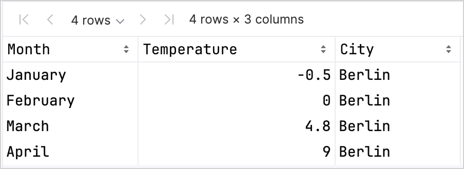
最初の 4 行を見て、新しい DataFrame の構造を確認します。
df.head(4)
DataFrame には、Month、Temperature、City の 3 つの列があることがわかります。 DataFrame の最初の 4 行には、1 月から 4 月までのベルリンの気温のレコードが含まれています。
Kandy および Kotlin DataFrame ライブラリを連携して使用する場合に、型安全性を高めるのに役立つ列のレコードにアクセスするためのさまざまなオプションがあります。 詳細については、Access APIs を参照してください。
折れ線グラフを作成する
前のセクションの df DataFrame を使用して、Kotlin Notebook で折れ線グラフを作成しましょう。
Kandy ライブラリの plot() 関数を使用します。plot() 関数内で、グラフの種類(この場合は line)と、X 軸と Y 軸の値を指定します。色とサイズをカスタマイズできます。
df.plot {
    line {
        // Accesses the DataFrame's columns used for the X and Y axes
        x(Month)
        y(Temperature)
        // Accesses the DataFrame's column used for categories and sets colors for these categories
        color(City) {
            scale = categorical("Berlin" to Color.PURPLE, "Madrid" to Color.ORANGE, "Caracas" to Color.GREEN)
        }
        // Customizes the line's size
        width = 1.5
    }
    // Customizes the chart's layout size
    layout.size = 1000 to 450
}
結果は次のとおりです。

ポイントグラフを作成する
次に、df DataFrame をポイント(散布図)グラフで可視化しましょう。
plot() 関数内で、points グラフの種類を指定します。X 軸と Y 軸の値と、df 列のカテゴリ値を追加します。
グラフに見出しを含めることもできます。
df.plot {
    points {
        // Accesses the DataFrame's columns used for the X and Y axes
        x(Month) { axis.name = "Month" }
        y(Temperature) { axis.name = "Temperature" }
        // Customizes the point's size
        size = 5.5
        // Accesses the DataFrame's column used for categories and sets colors for these categories
        color(City) {
            scale = categorical("Berlin" to Color.LIGHT_GREEN, "Madrid" to Color.BLACK, "Caracas" to Color.YELLOW)
        }
    }
    // Adds a chart heading
    layout.title = "Temperature per month"
}
結果は次のとおりです。

棒グラフを作成する
最後に、前のグラフと同じデータを使用して、都市別にグループ化された棒グラフを作成しましょう。 色には、16 進数コードも使用できます。
// Groups by cities
df.groupBy { City }.plot {
    // Adds a chart heading
    layout.title = "Temperature per month"
    bars {
        // Accesses the DataFrame's columns used for the X and Y axes
        x(Month)
        y(Temperature)
        // Accesses the DataFrame's column used for categories and sets colors for these categories
        fillColor(City) {
            scale = categorical(
                "Berlin" to Color.hex("#6F4E37"),
                "Madrid" to Color.hex("#C2D4AB"),
                "Caracas" to Color.hex("#B5651D")
            )
        }
    }
}
結果は次のとおりです。

次のステップ
- Kandy ライブラリドキュメント で、グラフの例をさらに探します。
- Lets-Plot ライブラリドキュメント で、より高度なプロットオプションを探します。
- Kotlin DataFrame ライブラリドキュメント で、データフレームの作成、探索、および管理に関する追加情報を見つけます。
- この YouTube video で、Kotlin Notebook でのデータ可視化について詳しく学びます。