Kotlin向けLets-Plotによるデータ可視化
Lets-Plot for Kotlin (LPK)は、R's ggplot2 libraryをKotlinに移植したマルチプラットフォームのプロットライブラリです。LPKは、機能豊富なggplot2 APIをKotlinエコシステムにもたらし、高度なデータ可視化機能を必要とする科学者や統計学者に適しています。
LPKは、Kotlin notebooks、Kotlin/JS、JVM's Swing、JavaFX、Compose Multiplatformなど、さまざまなプラットフォームをターゲットにしています。 さらに、LPKはIntelliJ、DataGrip、DataSpell、PyCharmとシームレスに統合されています。
このチュートリアルでは、IntelliJ IDEAのKotlin Notebookを使用して、LPKとKotlin DataFrameライブラリでさまざまな種類のプロットを作成する方法を説明します。
始める前に
-
最新バージョンのIntelliJ IDEA Ultimateをダウンロードしてインストールします。
-
IntelliJ IDEAにKotlin Notebook pluginをインストールします。
または、IntelliJ IDEA内のSettings | Plugins | MarketplaceからKotlin Notebookプラグインにアクセスします。
-
File | New | Kotlin Notebookを選択して、新しいノートブックを作成します。
-
ノートブックで、次のコマンドを実行してLPKライブラリとKotlin DataFrameライブラリをインポートします。
%use lets-plot
%use dataframe
データの準備
ベルリン、マドリード、カラカスの月間平均気温のシミュレーション数を格納するDataFrameを作成しましょう。
Kotlin DataFrameライブラリのdataFrameOf()関数を使用して、DataFrameを生成します。次のコードスニペットをコピーしてKotlin Notebookで実行します。
// The months variable stores a list with 12 months of the year
val months = listOf(
"January", "February",
"March", "April", "May",
"June", "July", "August",
"September", "October", "November",
"December"
)
// The tempBerlin, tempMadrid, and tempCaracas variables store a list with temperature values for each month
val tempBerlin =
listOf(-0.5, 0.0, 4.8, 9.0, 14.3, 17.5, 19.2, 18.9, 14.5, 9.7, 4.7, 1.0)
val tempMadrid =
listOf(6.3, 7.9, 11.2, 12.9, 16.7, 21.1, 24.7, 24.2, 20.3, 15.4, 9.9, 6.6)
val tempCaracas =
listOf(27.5, 28.9, 29.6, 30.9, 31.7, 35.1, 33.8, 32.2, 31.3, 29.4, 28.9, 27.6)
// The df variable stores a DataFrame of three columns, including monthly records, temperature, and cities
val df = dataFrameOf(
"Month" to months + months + months,
"Temperature" to tempBerlin + tempMadrid + tempCaracas,
"City" to List(12) { "Berlin" } + List(12) { "Madrid" } + List(12) { "Caracas" }
)
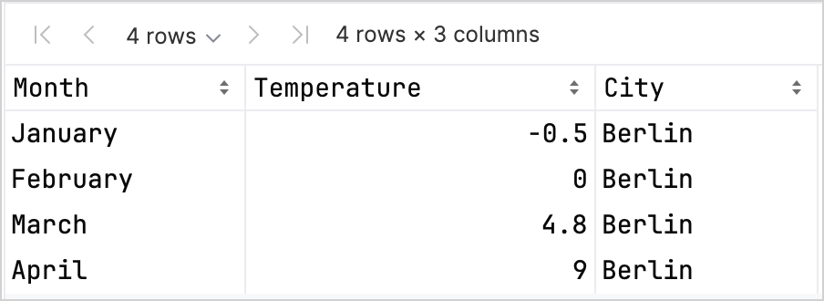
df.head(4)
DataFrameには、Month、Temperature、Cityの3つの列があることがわかります。DataFrameの最初の4行には、1月から4月までのベルリンの気温の記録が含まれています。
LPKライブラリを使用してプロットを作成するには、データをキーと値のペアで格納するMap型に変換する必要があります。.toMap()関数を使用すると、DataFrameをMapに簡単に変換できます。
val data = df.toMap()
散布図の作成
LPKライブラリを使用して、Kotlin Notebookで散布図を作成しましょう。
データがMap形式になったら、LPKライブラリのgeomPoint()関数を使用して散布図を生成します。
X軸とY軸の値を指定したり、カテゴリとその色を定義したりできます。さらに、必要に応じてプロットのサイズと点の形状をカスタマイズできます。
// Specifies X and Y axes, categories and their color, plot size, and plot type
val scatterPlot =
    letsPlot(data) { x = "Month"; y = "Temperature"; color = "City" } + ggsize(600, 500) + geomPoint(shape = 15)
scatterPlot
結果は次のようになります。

箱ひげ図の作成
データを箱ひげ図で可視化しましょう。LPKライブラリのgeomBoxplot()関数を使用してプロットを生成し、scaleFillManual()関数で色をカスタマイズします。
// Specifies X and Y axes, categories, plot size, and plot type
val boxPlot = ggplot(data) { x = "City"; y = "Temperature" } + ggsize(700, 500) + geomBoxplot { fill = "City" } +
    // Customizes colors
    scaleFillManual(values = listOf("light_yellow", "light_magenta", "light_green"))
boxPlot
結果は次のようになります。

2D密度プロットの作成
次に、2D密度プロットを作成して、ランダムデータの分布と集中を可視化します。
2D密度プロットのデータの準備
-
データの処理とプロットの生成に必要な依存関係をインポートします。
%use lets-plot

@file:DependsOn("org.apache.commons:commons-math3:3.6.1")
import org.apache.commons.math3.distribution.MultivariateNormalDistribution
Kotlin Notebookへの依存関係のインポートの詳細については、Kotlin Notebookドキュメントを参照してください。
-
次のコードスニペットをコピーしてKotlin Notebookで実行し、2Dデータポイントのセットを作成します。
// Defines covariance matrices for three distributions
val cov0: Array<DoubleArray> = arrayOf(
    doubleArrayOf(1.0, -.8),
    doubleArrayOf(-.8, 1.0)
)

val cov1: Array<DoubleArray> = arrayOf(
    doubleArrayOf(1.0, .8),
    doubleArrayOf(.8, 1.0)
)

val cov2: Array<DoubleArray> = arrayOf(
    doubleArrayOf(10.0, .1),
    doubleArrayOf(.1, .1)
)

// Defines the number of samples
val n = 400

// Defines means for three distributions
val means0: DoubleArray = doubleArrayOf(-2.0, 0.0)
val means1: DoubleArray = doubleArrayOf(2.0, 0.0)
val means2: DoubleArray = doubleArrayOf(0.0, 1.0)

// Generates random samples from three multivariate normal distributions
val xy0 = MultivariateNormalDistribution(means0, cov0).sample(n)
val xy1 = MultivariateNormalDistribution(means1, cov1).sample(n)
val xy2 = MultivariateNormalDistribution(means2, cov2).sample(n)
上記のコードから、
xy0、xy1、xy2変数は2D(x, y)データポイントの配列を格納します。 -
データを
Map型に変換します。val data = mapOf(
"x" to (xy0.map { it[0] } + xy1.map { it[0] } + xy2.map { it[0] }).toList(),
"y" to (xy0.map { it[1] } + xy1.map { it[1] } + xy2.map { it[1] }).toList()
)
2D密度プロットの生成
前の手順のMapを使用して、2D密度プロット(geomDensity2D)を、背景に散布図(geomPoint)とともに作成し、データポイントと外れ値をより良く可視化します。scaleColorGradient()関数を使用して、色のスケールをカスタマイズできます。
val densityPlot = letsPlot(data) { x = "x"; y = "y" } + ggsize(600, 300) + geomPoint(
    color = "black",
    alpha = .1
) + geomDensity2D { color = "..level.." } +
        scaleColorGradient(low = "dark_green", high = "yellow", guide = guideColorbar(barHeight = 10, barWidth = 300)) +
        theme().legendPositionBottom()
densityPlot
結果は次のようになります。

次は何をしますか
- Lets-Plot for Kotlinのドキュメントで、より多くのプロット例をご覧ください。
- Lets-Plot for KotlinのAPIリファレンスを確認してください。
- Kotlin DataFrameとKandyライブラリのドキュメントで、Kotlinを使用したデータの変換と可視化について学習してください。
- Kotlin Notebookの使用法と主な機能に関する追加情報を見つけてください。