使用 Lets-Plot for Kotlin 進行資料視覺化
Lets-Plot for Kotlin (LPK) 是一個多平台繪圖函式庫,將 R 的 ggplot2 函式庫移植到 Kotlin。 LPK 將功能豐富的 ggplot2 API 引入 Kotlin 生態系統,使其適用於需要複雜資料視覺化能力的科學家和統計學家。
LPK 的目標平台包括 Kotlin Notebooks、Kotlin/JS、JVM 的 Swing、JavaFX 和 Compose Multiplatform。 此外,LPK 還與 IntelliJ、DataGrip、DataSpell 和 PyCharm 無縫整合。
本教學示範了如何使用 IntelliJ IDEA 中的 Kotlin Notebook,透過 LPK 和 Kotlin DataFrame 函式庫建立不同的圖表類型。
開始之前
-
下載並安裝最新版本的 IntelliJ IDEA Ultimate。
-
在 IntelliJ IDEA 中安裝 Kotlin Notebook plugin。
或者,從 IntelliJ IDEA 中的 Settings | Plugins | Marketplace 存取 Kotlin Notebook plugin。
-
選擇 File | New | Kotlin Notebook 建立新的 Notebook。
-
在您的 Notebook 中,執行以下指令匯入 LPK 和 Kotlin DataFrame 函式庫:
%use lets-plot
%use dataframe
準備資料
讓我們建立一個 DataFrame,儲存三個城市(柏林、馬德里和卡拉卡斯)每月平均溫度的模擬數字。
使用 Kotlin DataFrame 函式庫中的 dataFrameOf() 函式來產生 DataFrame。 在您的 Kotlin Notebook 中貼上並執行以下程式碼片段:
// The months variable stores a list with 12 months of the year
val months = listOf(
"January", "February",
"March", "April", "May",
"June", "July", "August",
"September", "October", "November",
"December"
)
// The tempBerlin, tempMadrid, and tempCaracas variables store a list with temperature values for each month
val tempBerlin =
listOf(-0.5, 0.0, 4.8, 9.0, 14.3, 17.5, 19.2, 18.9, 14.5, 9.7, 4.7, 1.0)
val tempMadrid =
listOf(6.3, 7.9, 11.2, 12.9, 16.7, 21.1, 24.7, 24.2, 20.3, 15.4, 9.9, 6.6)
val tempCaracas =
listOf(27.5, 28.9, 29.6, 30.9, 31.7, 35.1, 33.8, 32.2, 31.3, 29.4, 28.9, 27.6)
// The df variable stores a DataFrame of three columns, including monthly records, temperature, and cities
val df = dataFrameOf(
"Month" to months + months + months,
"Temperature" to tempBerlin + tempMadrid + tempCaracas,
"City" to List(12) { "Berlin" } + List(12) { "Madrid" } + List(12) { "Caracas" }
)
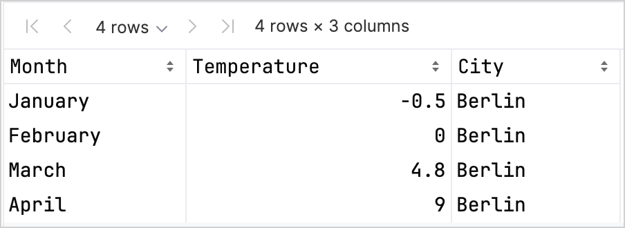
df.head(4)
您可以看到 DataFrame 有三欄:Month、Temperature 和 City。 DataFrame 的前四列包含柏林一月到四月的溫度記錄:
要使用 LPK 函式庫建立圖表,您需要將您的資料 (df) 轉換為 Map 類型,將資料儲存在鍵值對中。 您可以使用 .toMap() 函式輕鬆地將 DataFrame 轉換為 Map:
val data = df.toMap()
建立散佈圖
讓我們在 Kotlin Notebook 中使用 LPK 函式庫建立散佈圖。
一旦您的資料採用 Map 格式,請使用 LPK 函式庫中的 geomPoint() 函式來產生散佈圖。 您可以指定 X 軸和 Y 軸的值,以及定義類別及其顏色。 此外,您可以自訂圖表的大小和點形狀,以滿足您的需求:
// Specifies X and Y axes, categories and their color, plot size, and plot type
val scatterPlot =
    letsPlot(data) { x = "Month"; y = "Temperature"; color = "City" } + ggsize(600, 500) + geomPoint(shape = 15)
scatterPlot
結果如下:

建立盒鬚圖
讓我們在盒鬚圖中視覺化資料。 使用 LPK 函式庫中的 geomBoxplot() 函式來產生圖表,並使用 scaleFillManual() 函式自訂顏色:
// Specifies X and Y axes, categories, plot size, and plot type
val boxPlot = ggplot(data) { x = "City"; y = "Temperature" } + ggsize(700, 500) + geomBoxplot { fill = "City" } +
    // Customizes colors
    scaleFillManual(values = listOf("light_yellow", "light_magenta", "light_green"))
boxPlot
結果如下:

建立 2D 密度圖
現在,讓我們建立一個 2D 密度圖,以視覺化一些隨機資料的分布和集中程度。
準備 2D 密度圖的資料
-
匯入相依性以處理資料並產生圖表:
%use lets-plot

@file:DependsOn("org.apache.commons:commons-math3:3.6.1")
import org.apache.commons.math3.distribution.MultivariateNormalDistribution
有關將相依性匯入 Kotlin Notebook 的更多資訊,請參閱 Kotlin Notebook 文件。
-
在您的 Kotlin Notebook 中貼上並執行以下程式碼片段,以建立 2D 資料點集:
// Defines covariance matrices for three distributions
val cov0: Array<DoubleArray> = arrayOf(
    doubleArrayOf(1.0, -.8),
    doubleArrayOf(-.8, 1.0)
)

val cov1: Array<DoubleArray> = arrayOf(
    doubleArrayOf(1.0, .8),
    doubleArrayOf(.8, 1.0)
)

val cov2: Array<DoubleArray> = arrayOf(
    doubleArrayOf(10.0, .1),
    doubleArrayOf(.1, .1)
)

// Defines the number of samples
val n = 400

// Defines means for three distributions
val means0: DoubleArray = doubleArrayOf(-2.0, 0.0)
val means1: DoubleArray = doubleArrayOf(2.0, 0.0)
val means2: DoubleArray = doubleArrayOf(0.0, 1.0)

// Generates random samples from three multivariate normal distributions
val xy0 = MultivariateNormalDistribution(means0, cov0).sample(n)
val xy1 = MultivariateNormalDistribution(means1, cov1).sample(n)
val xy2 = MultivariateNormalDistribution(means2, cov2).sample(n)
從上面的程式碼中,
xy0、xy1和xy2變數儲存包含 2D (x, y) 資料點的陣列。 -
將您的資料轉換為
Map類型:val data = mapOf(
"x" to (xy0.map { it[0] } + xy1.map { it[0] } + xy2.map { it[0] }).toList(),
"y" to (xy0.map { it[1] } + xy1.map { it[1] } + xy2.map { it[1] }).toList()
)
產生 2D 密度圖
使用前一步驟中的 Map,建立一個 2D 密度圖 (geomDensity2D),背景帶有散佈圖 (geomPoint),以更好地視覺化資料點和離群值。 您可以使用 scaleColorGradient() 函式來自訂顏色比例:
val densityPlot = letsPlot(data) { x = "x"; y = "y" } + ggsize(600, 300) + geomPoint(
    color = "black",
    alpha = .1
) + geomDensity2D { color = "..level.." } +
        scaleColorGradient(low = "dark_green", high = "yellow", guide = guideColorbar(barHeight = 10, barWidth = 300)) +
        theme().legendPositionBottom()
densityPlot
結果如下:

接下來
- 在 Lets-Plot for Kotlin 的文件中探索更多圖表示例。
- 查看 Lets-Plot for Kotlin 的 API 參考。
- 透過 Kotlin DataFrame 和 Kandy 函式庫文件,了解如何使用 Kotlin 轉換和視覺化資料。
- 尋找有關 Kotlin Notebook 的用法和主要功能 的其他資訊。