Kotlin용 Lets-Plot을 이용한 데이터 시각화
Kotlin용 Lets-Plot (LPK)는 R의 ggplot2 라이브러리를 Kotlin으로 포팅한 멀티 플랫폼 플로팅 라이브러리입니다. LPK는 기능이 풍부한 ggplot2 API를 Kotlin 생태계에 제공하여 정교한 데이터 시각화 기능이 필요한 과학자 및 통계학자에게 적합합니다.
LPK는 Kotlin 노트북, Kotlin/JS, JVM의 Swing, JavaFX, Compose Multiplatform 등 다양한 플랫폼을 대상으로 합니다. 또한 LPK는 IntelliJ, DataGrip, DataSpell 및 PyCharm과 완벽하게 통합됩니다.
이 튜토리얼에서는 IntelliJ IDEA의 Kotlin Notebook에서 LPK 및 Kotlin DataFrame 라이브러리를 사용하여 다양한 플롯 유형을 만드는 방법을 보여줍니다.
시작하기 전에
-
최신 버전의 IntelliJ IDEA Ultimate를 다운로드하여 설치합니다.
-
IntelliJ IDEA에 Kotlin Notebook plugin을 설치합니다.
또는 IntelliJ IDEA 내에서 Settings | Plugins | Marketplace에서 Kotlin Notebook plugin에 액세스합니다.
-
File | New | Kotlin Notebook을 선택하여 새 노트북을 만듭니다.
-
노트북에서 다음 명령을 실행하여 LPK 및 Kotlin DataFrame 라이브러리를 가져옵니다.
%use lets-plot
%use dataframe
데이터 준비
베를린, 마드리드, 카라카스의 월 평균 기온 시뮬레이션 숫자를 저장하는 DataFrame을 만들어 보겠습니다.
Kotlin DataFrame 라이브러리의 dataFrameOf() 함수를 사용하여 DataFrame을 생성합니다. Kotlin Notebook에 다음 코드 스니펫을 붙여넣고 실행합니다.
// The months variable stores a list with 12 months of the year
val months = listOf(
"January", "February",
"March", "April", "May",
"June", "July", "August",
"September", "October", "November",
"December"
)
// The tempBerlin, tempMadrid, and tempCaracas variables store a list with temperature values for each month
val tempBerlin =
listOf(-0.5, 0.0, 4.8, 9.0, 14.3, 17.5, 19.2, 18.9, 14.5, 9.7, 4.7, 1.0)
val tempMadrid =
listOf(6.3, 7.9, 11.2, 12.9, 16.7, 21.1, 24.7, 24.2, 20.3, 15.4, 9.9, 6.6)
val tempCaracas =
listOf(27.5, 28.9, 29.6, 30.9, 31.7, 35.1, 33.8, 32.2, 31.3, 29.4, 28.9, 27.6)
// The df variable stores a DataFrame of three columns, including monthly records, temperature, and cities
val df = dataFrameOf(
"Month" to months + months + months,
"Temperature" to tempBerlin + tempMadrid + tempCaracas,
"City" to List(12) { "Berlin" } + List(12) { "Madrid" } + List(12) { "Caracas" }
)
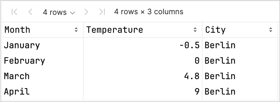
df.head(4)
DataFrame에는 Month, Temperature 및 City의 세 열이 있습니다. DataFrame의 처음 네 행에는 1월부터 4월까지 베를린의 온도 기록이 포함되어 있습니다.
LPK 라이브러리를 사용하여 플롯을 만들려면 데이터를 키-값 쌍으로 저장하는 Map 유형으로 데이터를 (df) 변환해야 합니다. .toMap() 함수를 사용하여 DataFrame을 Map으로 쉽게 변환할 수 있습니다.
val data = df.toMap()
산점도 만들기
LPK 라이브러리를 사용하여 Kotlin Notebook에서 산점도를 만들어 보겠습니다.
데이터가 Map 형식으로 있으면 LPK 라이브러리의 geomPoint() 함수를 사용하여 산점도를 생성합니다.
X축 및 Y축의 값을 지정하고 범주와 해당 색상을 정의할 수 있습니다. 또한 필요에 따라 플롯 크기 및 점 모양을 customization할 수 있습니다.
// Specifies X and Y axes, categories and their color, plot size, and plot type
val scatterPlot =
    letsPlot(data) { x = "Month"; y = "Temperature"; color = "City" } + ggsize(600, 500) + geomPoint(shape = 15)
scatterPlot
결과는 다음과 같습니다.

상자 그림 만들기
데이터를 상자 그림으로 시각화해 보겠습니다. LPK 라이브러리의 geomBoxplot() 함수를 사용하여 플롯을 생성하고 scaleFillManual() 함수로 색상을 customize합니다.
기능:
// Specifies X and Y axes, categories, plot size, and plot type
val boxPlot = ggplot(data) { x = "City"; y = "Temperature" } + ggsize(700, 500) + geomBoxplot { fill = "City" } +
    // Customizes colors
    scaleFillManual(values = listOf("light_yellow", "light_magenta", "light_green"))
boxPlot
결과는 다음과 같습니다.

2D 밀도 플롯 만들기
이제 2D 밀도 플롯을 만들어 일부 임의 데이터의 분포 및 집중도를 시각화해 보겠습니다.
2D 밀도 플롯에 대한 데이터 준비
-
데이터를 처리하고 플롯을 생성하기 위한 종속성을 가져옵니다.
%use lets-plot

@file:DependsOn("org.apache.commons:commons-math3:3.6.1")
import org.apache.commons.math3.distribution.MultivariateNormalDistribution
Kotlin Notebook에 종속성을 가져오는 방법에 대한 자세한 내용은 Kotlin Notebook documentation을 참조하세요.
-
Kotlin Notebook에 다음 코드 스니펫을 붙여넣고 실행하여 2D 데이터 포인트 세트를 만듭니다.
// Defines covariance matrices for three distributions
val cov0: Array<DoubleArray> = arrayOf(
    doubleArrayOf(1.0, -.8),
    doubleArrayOf(-.8, 1.0)
)

val cov1: Array<DoubleArray> = arrayOf(
    doubleArrayOf(1.0, .8),
    doubleArrayOf(.8, 1.0)
)

val cov2: Array<DoubleArray> = arrayOf(
    doubleArrayOf(10.0, .1),
    doubleArrayOf(.1, .1)
)

// Defines the number of samples
val n = 400

// Defines means for three distributions
val means0: DoubleArray = doubleArrayOf(-2.0, 0.0)
val means1: DoubleArray = doubleArrayOf(2.0, 0.0)
val means2: DoubleArray = doubleArrayOf(0.0, 1.0)

// Generates random samples from three multivariate normal distributions
val xy0 = MultivariateNormalDistribution(means0, cov0).sample(n)
val xy1 = MultivariateNormalDistribution(means1, cov1).sample(n)
val xy2 = MultivariateNormalDistribution(means2, cov2).sample(n)
위의 코드에서
xy0,xy1및xy2변수는 2D (x, y) 데이터 포인트가 있는 배열을 저장합니다. -
데이터를
Map유형으로 변환합니다.val data = mapOf(
"x" to (xy0.map { it[0] } + xy1.map { it[0] } + xy2.map { it[0] }).toList(),
"y" to (xy0.map { it[1] } + xy1.map { it[1] } + xy2.map { it[1] }).toList()
)
2D 밀도 플롯 생성
이전 단계의 Map을 사용하여 2D 밀도 플롯(geomDensity2D)을 만들고 배경에 산점도(geomPoint)를 추가하여 데이터 포인트 및 이상값을 더 잘 시각화합니다. scaleColorGradient() 함수를 사용하여 색상 축척을 사용자 지정할 수 있습니다.
val densityPlot = letsPlot(data) { x = "x"; y = "y" } + ggsize(600, 300) + geomPoint(
    color = "black",
    alpha = .1
) + geomDensity2D { color = "..level.." } +
        scaleColorGradient(low = "dark_green", high = "yellow", guide = guideColorbar(barHeight = 10, barWidth = 300)) +
        theme().legendPositionBottom()
densityPlot
결과는 다음과 같습니다.

다음 단계
- Kotlin용 Lets-Plot 문서에서 더 많은 플롯 예제를 살펴보세요.
- Kotlin용 Lets-Plot의 API reference를 확인하세요.
- Kotlin DataFrame 및 Kandy 라이브러리 문서에서 Kotlin으로 데이터를 변환하고 시각화하는 방법에 대해 알아보세요.
- Kotlin Notebook의 사용법 및 주요 기능에 대한 추가 정보를 찾아보세요.